
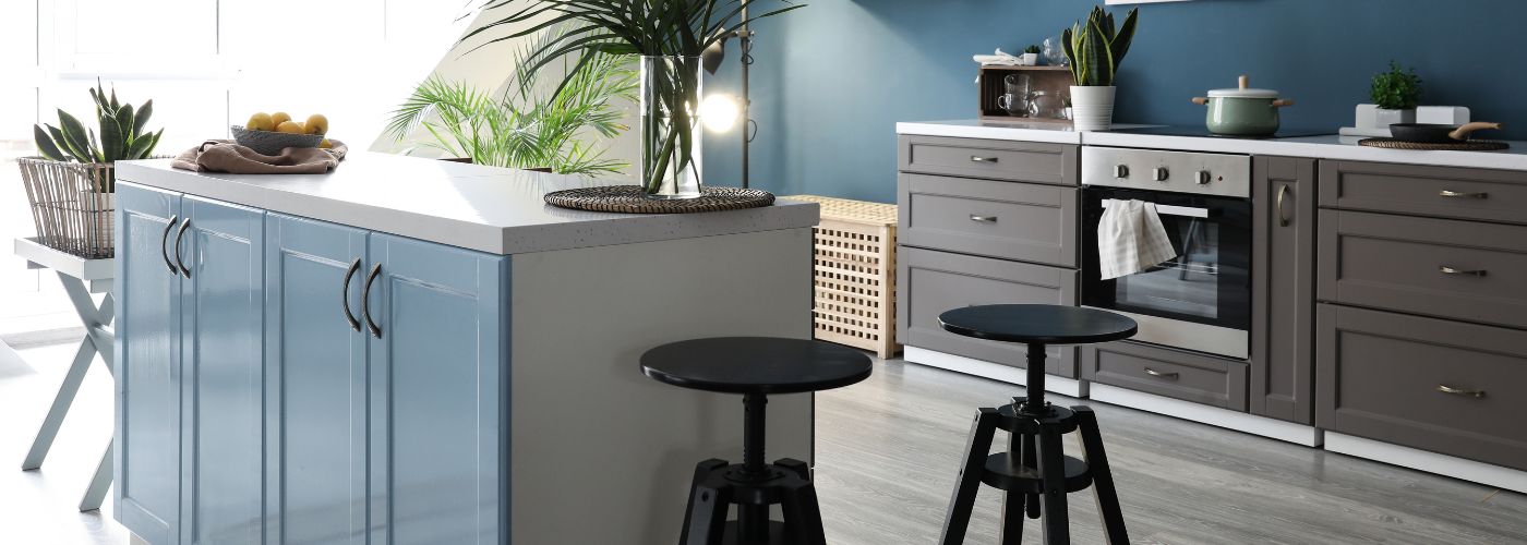
Choosing the right countertop can change a kitchen’s entire look because it connects many of the room’s largest design elements. Color, lighting, cabinets, flooring, and surrounding finishes all influence how the final surface will look, and this article goes over the main factors to consider when making your choice.
Popular Countertop Colors For Kitchens
There are many countertop colors available, but some choices are easier to work into a kitchen than others. White, cream, beige, gray, black, and natural stone tones remain popular because they can work with a wide range of cabinet finishes and design styles.
A white surface can make a kitchen feel clean and open, while gray can add depth without making the room feel too dark. Beige and cream can create a softer look that works especially well in warm, traditional kitchens.
Also, think beyond the basic color name. Two white countertops can look completely different if one has warm gold veining and the other has cool gray details. Natural patterns, speckles, and veining can also affect how strongly a countertop stands out in the room.
When making these decisions, following a few helpful material selection tips can make it easier to compare finishes without focusing on color alone. The best countertop choice should feel connected to the kitchen as a whole, not like a separate design element.
Match Countertop Colors With Your Kitchen Cabinets
Kitchen cabinets usually take up a large amount of visual space, so they should be one of the first things you consider when selecting countertop colors. You don’t necessarily need to match the two surfaces. Instead, look for tones that complement each other.
Warm wood cabinets often pair naturally with cream, beige, soft white, and other warm surfaces, while cool gray or white cabinets can work well with gray, white, black, and stone-inspired finishes.
Using actual cabinet and countertop samples together is one of the easiest ways to see whether their undertones work well in the same room. A small undertone difference can become much more noticeable when the materials cover large areas.
This matters especially when upgrading your kitchen cabinets, since changing the cabinet color or finish may affect which countertop shades look most natural beside them.
Use Dark Countertops to Create Visual Contrast
Dark countertop colors can create strong contrast when placed next to light cabinets. Black, charcoal, deep gray, and darker stone finishes can add definition to a kitchen while drawing attention to the work surfaces.
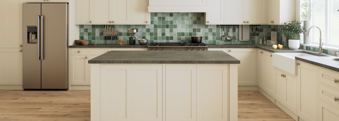
This approach works especially well with white or light wood cabinetry because the contrast creates clear visual separation. A darker countertop can also become an important part of a modern or dramatic kitchen design.
However, the amount of dark material should match the room’s size and lighting. A kitchen with large windows, light cabinets, and bright walls may handle a dark surface easily, while a room with limited natural light may require more balance.
Contrast works best when the darker surface has enough lighter elements around it to keep the kitchen from feeling visually heavy.
Looking at the entire room under both natural and artificial light can help you understand how strong that contrast will actually appear.
Consider Light Countertop Colors for Smaller Kitchens
Light countertop colors can be especially useful in a smaller kitchen because they tend to create a brighter visual appearance. White, ivory, cream, pale beige, and light gray surfaces reflect more available light than very dark materials.
Pairing these surfaces with lighter walls or cabinets can make the room feel more open. This does not physically increase the size of the kitchen, but it can reduce the heavy visual effect that sometimes occurs when several dark finishes are used in a compact area.
In a smaller kitchen, maintaining a smooth visual flow between the major surfaces can help the room feel less crowded. That does not mean every surface needs to be white or the exact same shade.
Slight differences can provide enough contrast to keep the room interesting while maintaining a bright overall appearance. For example, soft gray cabinets could be paired with an off-white surface, or natural wood cabinets could be balanced by a warm cream countertop.
Test the lighting before making the final decision. A surface that appears bright white in a showroom could look warmer or slightly darker inside your home.
Place samples in different areas of the kitchen and look at them during the morning, afternoon, and evening. This simple step can show how sunlight, overhead fixtures, and under-cabinet lighting affect the material throughout the day.
Coordinate Countertop Colors With Flooring and Backsplashes
Countertops don’t exist on their own, so consider flooring and backsplash materials before deciding. These surfaces often sit close together and can contain their own patterns, textures, and undertones.
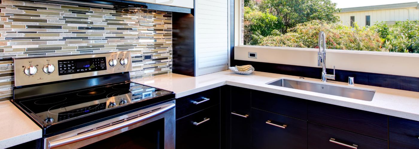
A kitchen with warm wood cabinets, for example, may feel more balanced with flooring that carries similar warm details. The same principle applies when choosing tile and flooring, since the tones beneath the cabinets can influence how the countertop appears from across the room.
A backsplash deserves special attention because it touches the countertop directly. When both materials have strong patterns, they can compete for attention and make the kitchen appear overly busy.
A heavily veined surface often works better with a simpler backsplash, while a quiet countertop gives you more freedom to use decorative tile or stronger patterns.
If you are choosing a kitchen backsplash at the same time, placing samples directly beside the countertop can reveal combinations that may not be obvious when viewing each material separately.
Balancing pattern, texture, and color lets each surface add interest without competing with the others.
Choose Neutral Countertop Tones for Design Flexibility
Neutral countertop colors can be a practical choice for homeowners who want flexibility as their kitchen changes over time. White, gray, cream, beige, and other subtle natural tones can work with many cabinet finishes, wall colors, hardware styles, and decorative accents.
Neutral does not have to mean plain, either. Stone patterns, subtle veining, texture, and tone variations can add visual interest while keeping the overall design adaptable.
Think about which parts of the kitchen you are most likely to change in the future. Paint, lighting, cabinet hardware, chairs, and decorative items are generally easier to update than a countertop.
Keeping a major surface versatile gives you more freedom to introduce different colors through those easier-to-change elements. This is similar to other interior design choices, where permanent finishes can provide a foundation while smaller details bring more personality into the room.
Neutral doesn’t mean every element needs to blend into the background. You can still use contrast through cabinets, flooring, backsplash tile, fixtures, or accessories, while letting the countertop connect those features.
A versatile surface gives the kitchen a stable design foundation while leaving room for your style to change over time. By comparing samples with the permanent features already in the room, you can select a tone that looks balanced today without unnecessarily limiting future updates.
How to Love Your Home Again
Sometimes we can feel uninspired and tiresome with the home we once loved so dearly.
Jan
Affordable Ways to Glamorize Your Home
There are many affordable ways to glamorize your home; elka Interiors & Construction is here
Jan
How to Stage Your Bathroom to Add Appeal
Home staging is a great way to incorporate an added sense of luxury and increase
Jan